-
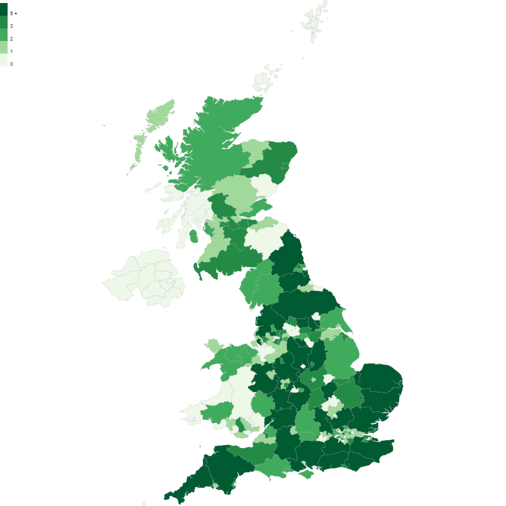
Create a postcode heatmap in three easy steps
Discover how you can take a spreadsheet of customer data and transform it into a stunning postcode heatmap that you can put in your presentations and reports without having to use any complicated and expensive software.
-
Create and Visualise Sales Territory Maps
We’re excited to announce a major new addition to Postcodeheatmap: Custom Territory Maps — built especially for organisations with multiple teams working across different geographic regions. If you manage sales teams, regional operations, or account territories, this new feature will help you define, visualise, and report on your custom territories with ease — all in…
-
Enhanced Stats, Smarter Reporting, and More Powerful Maps
We’ve rolled out a major new update to Postcodeheatmap, packed with features designed to give you deeper insights, more control, and greater clarity when working with postcode data. Whether you’re analyzing performance, targeting regions, or creating reports, these new tools will help you work smarter and tell clearer data stories. 📈 Enhanced Statistics: Smarter Insights…
-
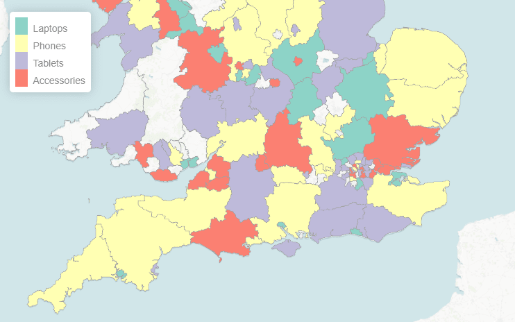
🗺️ New Feature: Category-Based Heatmaps (aka Qualitative Choropleth Maps)
We’re excited to introduce a powerful new way to visualise your data in Postcodeheatmap: Category-Based Heatmaps — also known as qualitative choropleth maps. Put simply, these maps let you colour regions (like counties or postcode areas) based on categories found in your spreadsheet — so you can see what’s most popular where. 🎯 What Are…
-
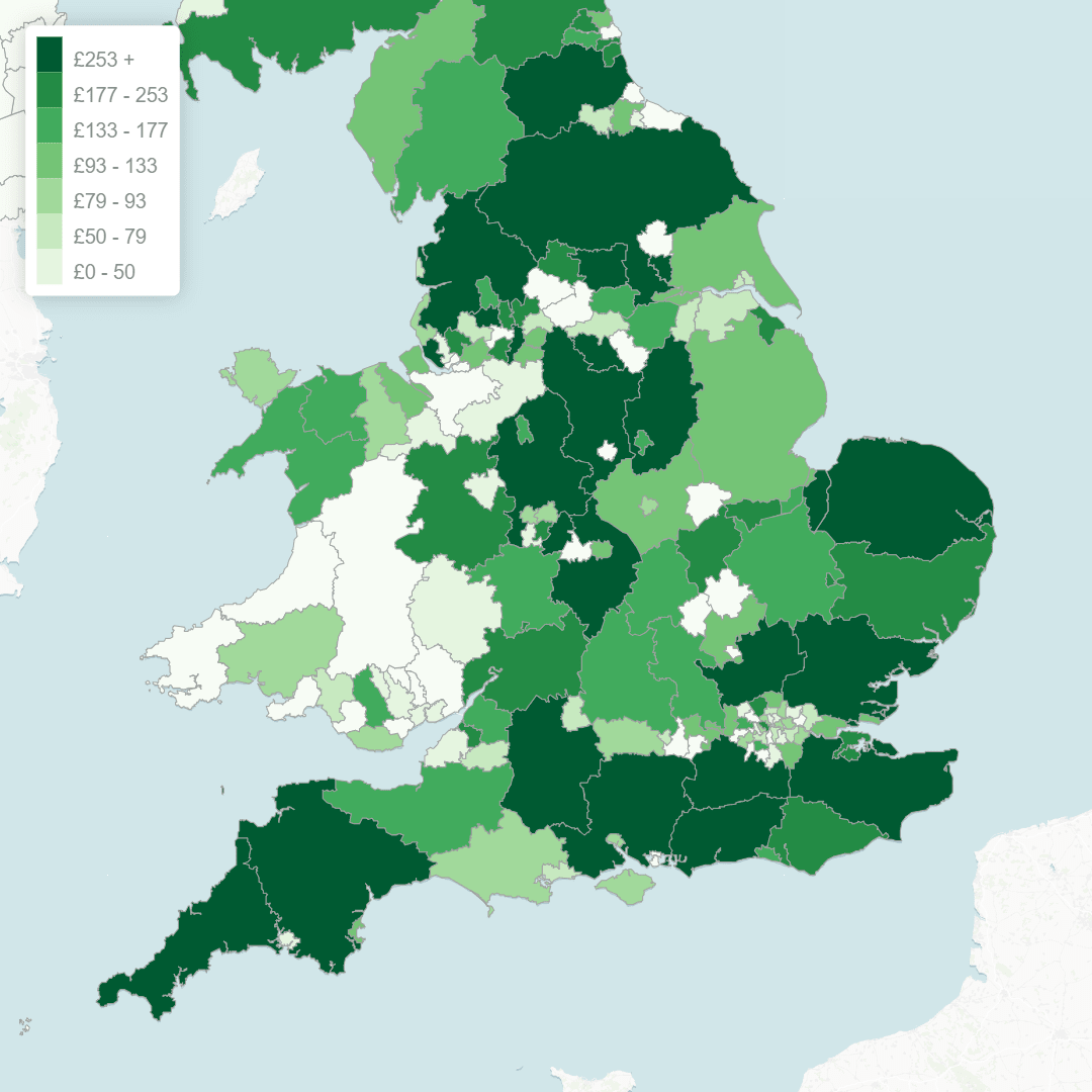
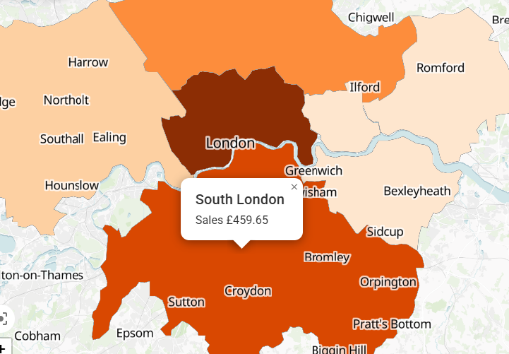
💰 New Heatmap Types: Visualise Revenue, Metrics & More
Over the past few weeks, we’ve been working hard to expand how Postcodeheatmap handles imported data — and we’re excited to introduce a set of powerful new features that let you create Revenue Heatmaps and Measure Heatmaps, along with flexible data formatting options. These enhancements give you greater insight into your data by allowing you…
-
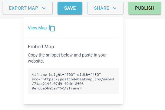
🌐 New Feature: Embed Interactive Maps on Your Website
We’re excited to announce a powerful new feature for Postcodeheatmap Pro users — you can now embed interactive maps directly into your website, CMS, or company intranet. Whether you’re building a public-facing dashboard, internal report, or a client portal, this feature makes it easy to share your map visualisations in a seamless and professional way.…
-
📌 New Feature: Marker Layers Are Now Live!
It’s finally here — one of the most anticipated features in Postcodeheatmap: Marker Layers! This powerful update lets you visualise multiple datasets on a single map, making it easier than ever to compare and analyze complex data. 🔍 Visualise More, Side-by-Side With Marker Layers, you can now overlay different types of data on the same…
-
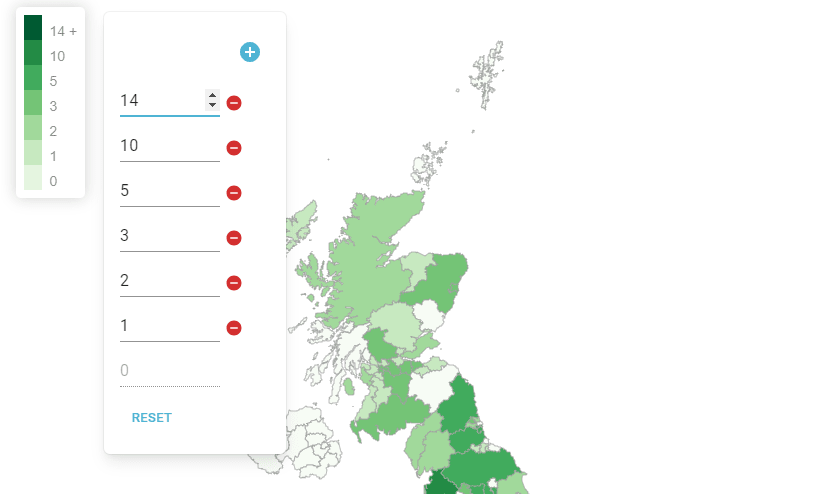
🎨 New Feature: Custom Map Scales Are Here!
While we’ve been hard at work on some major updates coming soon to Postcodeheatmap, we’re excited to announce that a long-requested feature is now live: Custom Map Scales! 🎛️ Fine-Tune Your Heatmaps With this new feature, you now have full control over how your heatmap data is represented. Adjust the scale thresholds to better reflect…
-
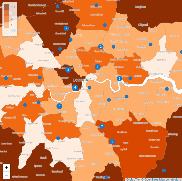
🎉 New in Postcodeheatmap: Map Markers & More – April 2024 Update
We’re excited to share the latest updates to Postcodeheatmap, including one of our most requested features: Map Markers! 📍 Introducing Map Markers You asked, we listened! You can now add marker layers to your heatmaps, making it easier than ever to visualize data points like store locations, delivery drop-offs, or customer addresses alongside your postcode…
-

Postcodeheatmap API Usage Guide
Introduction The Postcodeheatmap API is a RESTful API designed to allow for automating the synchronisation of map visualisations created using Postcodeheatmap with external data pipelines. In short, this API provides the ability for developers to bulk import data into Postcodeheatmap and update existing maps. Authentication The API uses API key based authentication. API keys can…
-
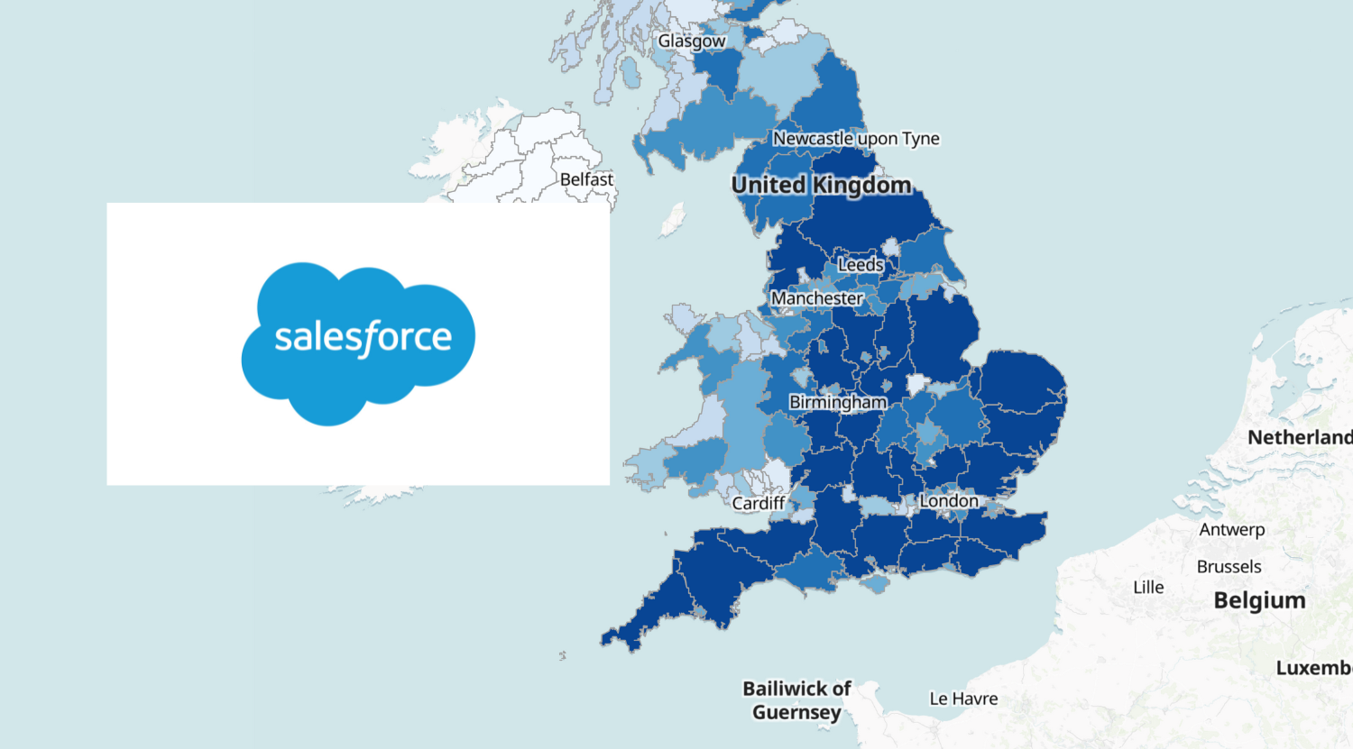
How to Easily Create a Salesforce Opportunities Heatmap
A postcode heatmap is a type of map that uses different colours or shades to represent data in specific geographic areas, like states or counties. When visualising Salesforce opportunities, a postcode heatmap can help you easily see how sales or potential deals vary across different areas. Here’s how it could be useful: In short, a…