Introduction
In the world of data visualisation, choropleth maps are invaluable tools for displaying spatial variations and patterns. They use different shades or colours to represent data values across various geographic areas, making complex data easier to understand. From illustrating population density to election results, choropleth maps provide a clear visual representation of how a particular variable is distributed geographically. This detailed guide will walk you through the entire process of creating a choropleth map, from data collection to final refinement.
Understanding Choropleth Maps
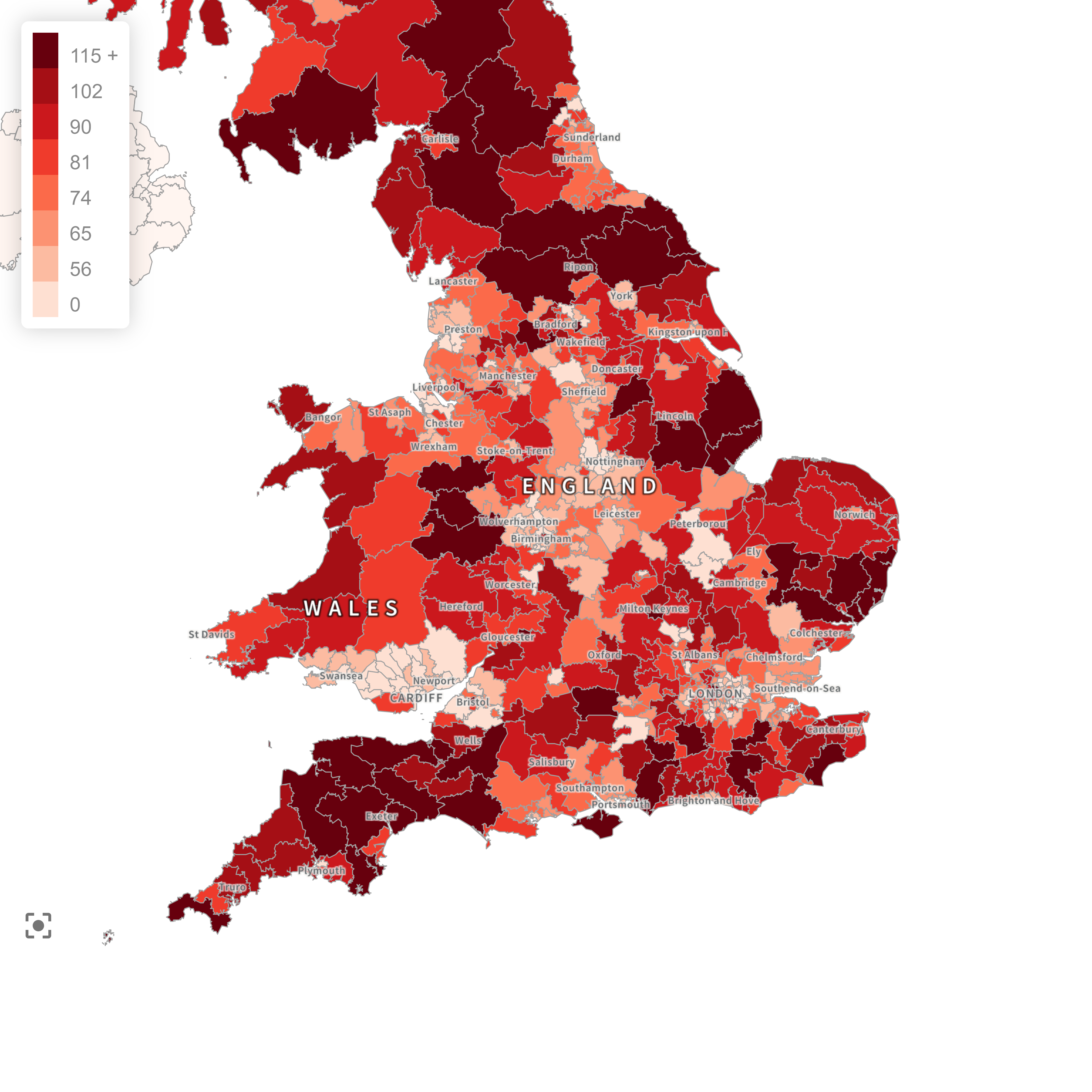
A choropleth map is a thematic map where areas (such as countries, states, or counties) are shaded or coloured in proportion to the value of the variable being represented. This method allows for quick visual comparisons and can highlight regional patterns and trends effectively. For instance, darker shades might indicate higher values, while lighter shades represent lower values.
Step-by-Step Process of Creating Choropleth Maps
Creating a choropleth map involves several critical steps. Here’s a comprehensive guide to each stage of the process:
1. Define the Objective
Before you begin, it’s essential to clearly define the purpose of your map. Consider the following questions:
- What specific variable do you want to visualise?
- Who is your intended audience?
- What message or insight do you want to convey through the map?
A well-defined objective will guide you through the subsequent steps and help you make informed decisions throughout the map-making process.
2. Gather and Prepare Data
The accuracy and relevance of your data are crucial for the success of your choropleth map. Follow these steps to gather and prepare your data:
a. Identify Data Sources
Identify reliable sources for your data. These could include:
- Government databases (e.g., census data, economic reports)
- Research institutions and academic publications
- Business and industry reports
- Proprietary data from within your organisation
b. Collect Data
Collect the data that aligns with your objective. Ensure that the data is up-to-date, accurate, and relevant to your theme.
c. Clean and Organise Data
Clean and organise your data to ensure it is in a usable format. This might involve:
- Removing duplicates and errors
- Standardising data formats
- Handling missing values appropriately
d. Geocode Data
Geocoding is the process of converting addresses or location descriptions into geographic coordinates. If your data includes locations, you’ll need to geocode it to plot it on the map accurately.
3. Choose the Map Type
Although we are focusing on choropleth maps, it’s worth noting that your choice of map type should depend on the nature of your data and the message you want to convey. Choropleth maps are ideal for visualising density, percentage, or rate data across different geographic areas.
4. Design the Map
Designing your map involves selecting colours, symbols, and other visual elements. Follow these guidelines to ensure your map is visually appealing and easy to interpret:
a. Colour Schemes
Choose colour schemes that are intuitive and enhance readability. For choropleth maps, use gradient colours to represent different data ranges. Ensure that the colour transitions are smooth and logically convey increasing or decreasing values. It’s often effective to use a single hue with varying intensities, or a diverging colour scheme if you’re showing values above and below a midpoint.
b. Symbols
For choropleth maps, symbols typically aren’t used; instead, focus on the shading or colouring of the areas.
c. Legends and Labels
Include a clear and concise legend that explains the meaning of the colours and shades. Label key geographic features and data points to aid interpretation.
d. Layout
Design a balanced layout that directs the viewer’s attention to the most important parts of the map. Ensure that the map title, legend, and other elements are placed logically and do not clutter the map.
5. Data Classification
Classifying data involves grouping data values into categories or classes. This step is particularly important for choropleth maps. There are several methods for data classification:
a. Equal Interval
Divide the range of data values into equal-sized intervals. This method is simple and easy to interpret but may not work well if the data is skewed.
b. Quantiles
Divide the data into intervals that each contain an equal number of data points. This method ensures that each category has a similar number of areas but can result in unevenly spaced intervals.
c. Natural Breaks (Jenks)
Use statistical methods to identify natural groupings within the data. This method minimises the variance within each class and maximises the variance between classes, resulting in more meaningful categories.
d. Standard Deviation
Classify data based on how much values deviate from the mean. This method is useful for identifying areas that are significantly above or below the average.
6. Map Production
Using Geographic Information System (GIS) software or specialised mapping tools, you can produce your choropleth map. Popular GIS software includes ArcGIS, QGIS, and MapInfo. Here’s how to proceed:
a. Import Data
Import your prepared data into the GIS software. Ensure that the data is correctly geocoded and aligned with the geographic boundaries you’ll be mapping.
b. Apply Classification
Apply the chosen classification method to your data. This will involve setting up the data ranges and assigning colours to each range.
c. Add Visual Elements
Add the necessary visual elements, such as legends, labels, and titles. Ensure that these elements are clear and help interpret the map.
d. Fine-Tune Design
Adjust the design elements to enhance clarity and readability. This might involve tweaking colours, adjusting symbol sizes, or refining the layout.
7. Review and Refine
The final step is to review your map for accuracy, clarity, and effectiveness. Consider the following:
a. Accuracy
Double-check the data and ensure that it has been accurately represented on the map. Verify the geographic boundaries, data classifications, and geocoding.
b. Clarity
Ensure that the map is easy to read and interpret. The colours, symbols, and labels should be clear and distinct. The legend should effectively explain the visual elements.
c. Effectiveness
Assess whether the map effectively communicates the intended message. Seek feedback from colleagues or other stakeholders and make necessary adjustments based on their input.
Best Practices for Creating Choropleth Maps
To ensure your choropleth map is effective and accurate, consider these best practices:
1. Use Appropriate Colour Schemes
Choose colour schemes that are intuitive and enhance readability. Avoid using too many colours, as this can make the map confusing. Stick to a single hue with varying intensities or a diverging colour scheme if showing values above and below a midpoint.
2. Provide a Clear Legend
A clear and concise legend
is crucial for interpreting a choropleth map. Ensure the legend explains the meaning of the colours and shades used in the map.
3. Keep It Simple
Avoid cluttering the map with too many elements. Focus on the data and the message you want to convey. Additional information can be provided in accompanying text or separate visualisations.
4. Test Different Classification Methods
Experiment with different data classification methods to see which one best represents your data. Each method has its strengths and weaknesses, so choose the one that provides the most meaningful insights.
5. Ensure Data Accuracy
Double-check your data for accuracy before creating the map. Inaccurate data can lead to misleading visualisations and incorrect conclusions.
Conclusion
Creating choropleth maps involves a systematic process of defining objectives, gathering and preparing data, choosing appropriate classifications, designing the map, and refining the final product. By following these steps, you can create choropleth maps that effectively visualise spatial data and provide valuable insights.
Whether you are a business analyst, researcher, or anyone interested in data visualisation, understanding how to create choropleth maps is a valuable skill. These maps not only make complex data more accessible but also uncover patterns and relationships that might otherwise go unnoticed. With the right approach and tools, you can harness the power of choropleth maps to enhance your data analysis and decision-making processes.
To easily create choropleth maps from your postcode data, try using Postcodeheatmap.com.
Leave a Reply