We’re excited to introduce a powerful new way to visualise your data in Postcodeheatmap: Category-Based Heatmaps — also known as qualitative choropleth maps.
Put simply, these maps let you colour regions (like counties or postcode areas) based on categories found in your spreadsheet — so you can see what’s most popular where.
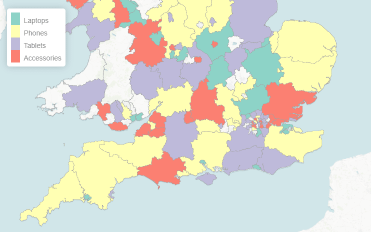
🎯 What Are Category-Based Heatmaps?
Unlike traditional heatmaps that show counts or numeric values, category heatmaps highlight the most common category in each region.
Example use case:
Let’s say you have a spreadsheet of customer orders, and one column includes product codes. With this new feature, you can instantly see:
- Which products are most popular in each county
- Regional trends by product, service, or any classification you track
Each region is coloured based on the top category found there, making it easy to spot geographic patterns at a glance.
➡️ Try it: Create a Category Heatmap
⚙️ How It Works
Creating a category-based heatmap is simple:
- Import your spreadsheet
- Choose the column that contains your category or classification
- Postcodeheatmap will analyse the data and assign colours based on the most common category in each region
- Click the map legend to customise the labels and colours for each category
Whether you’re tracking product popularity, service usage, team territories, or customer types, this feature gives you a new layer of insight and storytelling for your data.
To try these features and create beautiful postcode heatmaps then head over to https://postcodeheatmap.com/.