Over the past few weeks, we’ve been working hard to expand how Postcodeheatmap handles imported data — and we’re excited to introduce a set of powerful new features that let you create Revenue Heatmaps and Measure Heatmaps, along with flexible data formatting options.
These enhancements give you greater insight into your data by allowing you to visualise numeric values by postcode, aggregated across counties and other geographic boundaries.
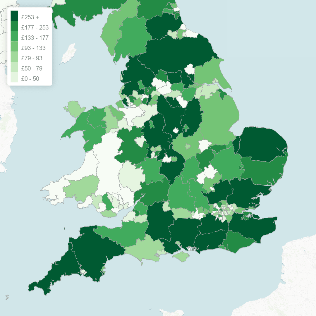
💵 Revenue Heatmaps
Got a spreadsheet with monetary values? You can now turn it into a heatmap showing total revenue by region.
Example use case:
- Visualise total sales revenue by county
- Spot high-performing areas at a glance
How to create:
- Import your spreadsheet
- Specify which column contains Postcodes
- Select the column with your Monetary values
- Done — Postcodeheatmap will sum values by region and generate your heatmap
➡️ Try it: Create a Revenue Heat Map
📊 Measure Heatmaps
You’re no longer limited to simple counts — you can now use any numerical data to build powerful, aggregated heatmaps.
Example use case:
- Visualise total order quantities by region
- Track the number of service visits per area
How to create:
- Import your spreadsheet
- Choose your Postcode column
- Specify the Measure column containing your numeric data
➡️ Try it: Create a Measure Heat Map
🎨 Custom Data Formatting
To complement these new map types, you can now configure:
- Display Title: Customize how the data label appears on your map (e.g., “Revenue” instead of “Count”)
- Display Prefix: Add a prefix like “£” or “$” for monetary values to make your maps more informative and polished
These updates make your heatmaps more meaningful, tailored, and presentation-ready.
To try these features and create beautiful postcode heatmaps then head over to https://postcodeheatmap.com/.